Enjoy the Nature's Gift!

Project Summary

This is a design test when I was applying to FreshWorks Studio, which was done in 2 days. Day 1 was majorly for researching, ideating, and wireframing. Day 2 was for high-fidelity design and documenting.

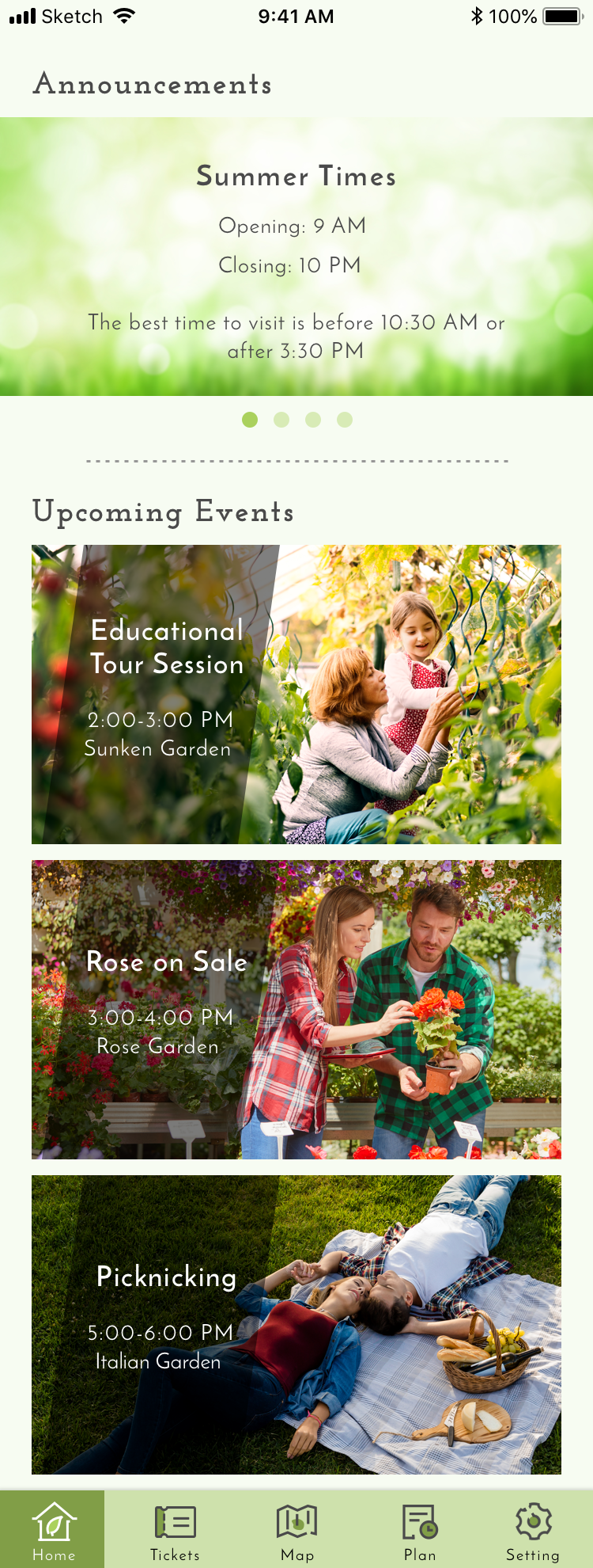
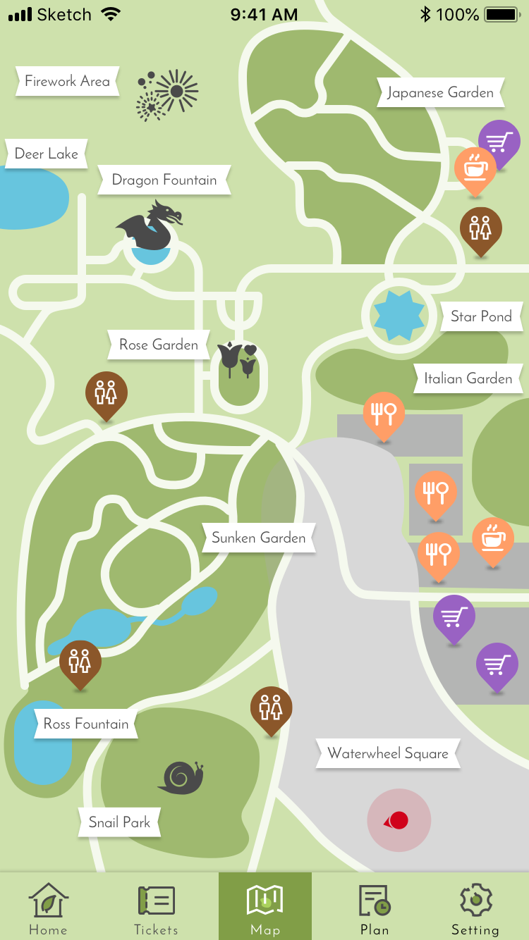
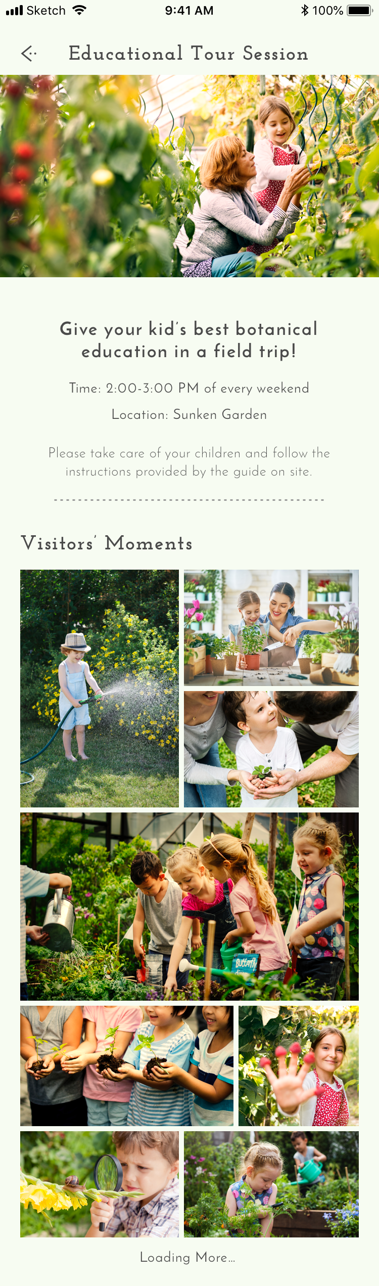
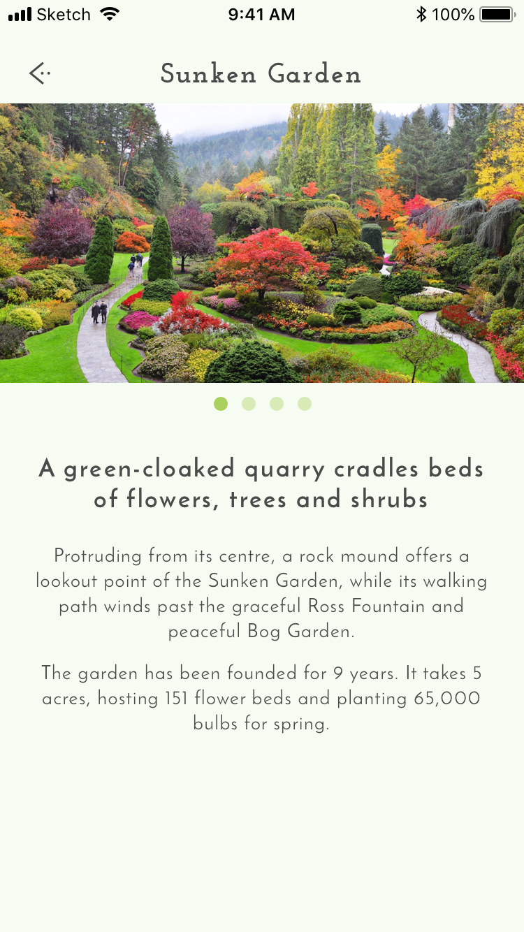
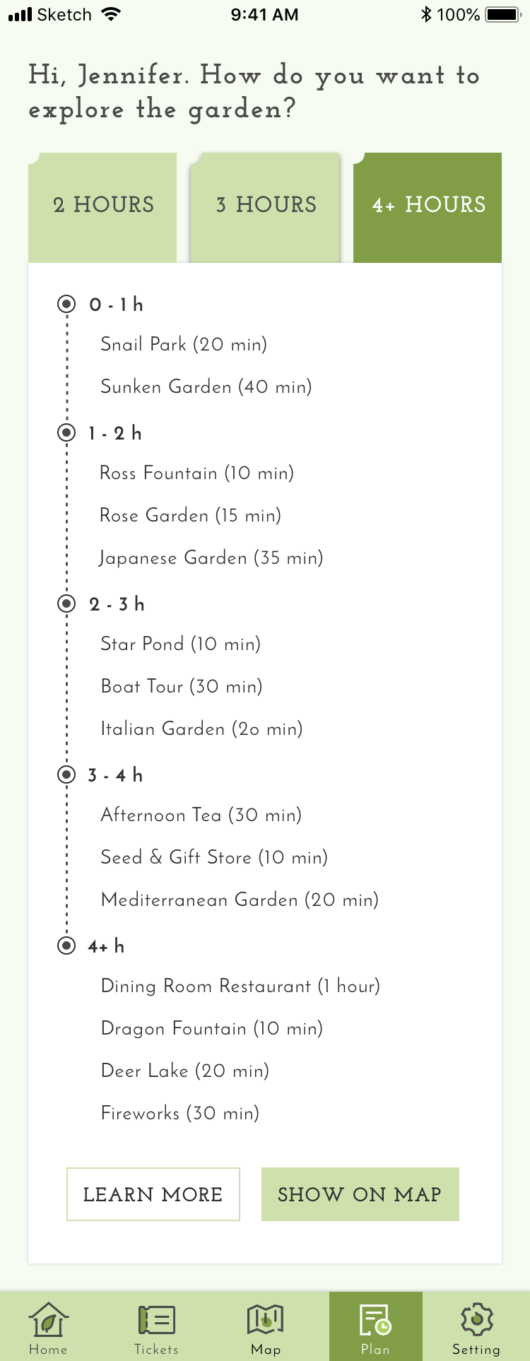
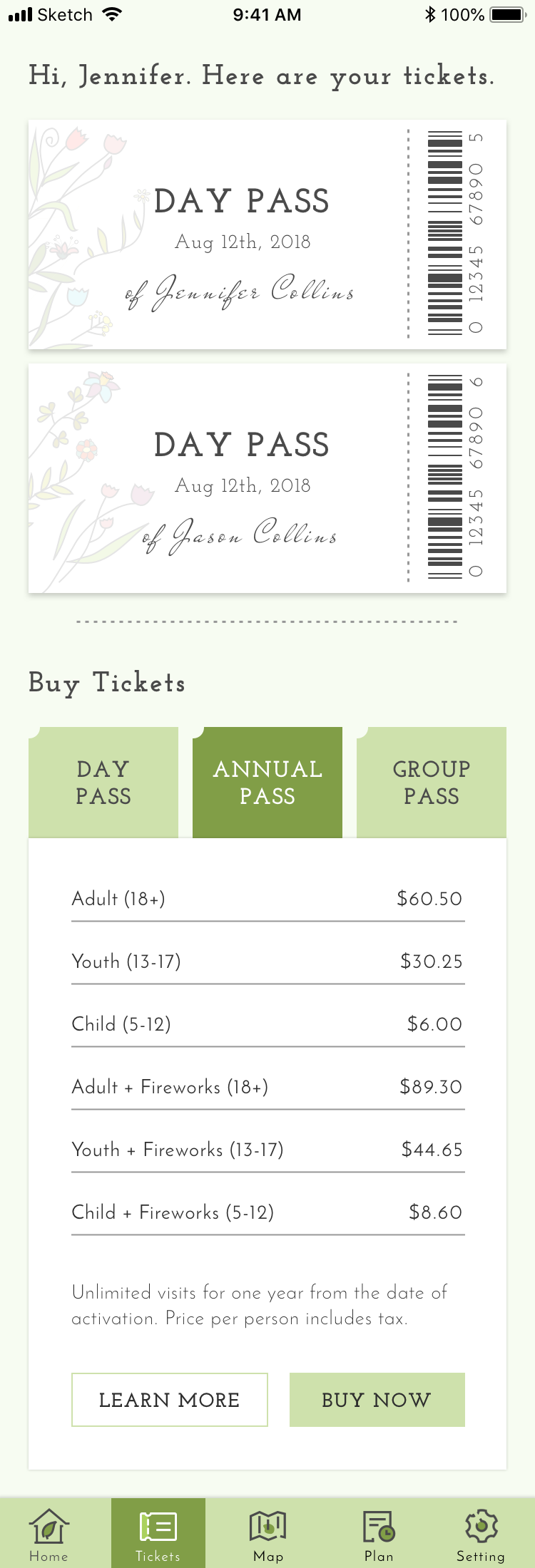
The assignment requirement is: XYZ Gardens is in need of a mobile app to improve the tour experience on site and grow their revenues. The app will supplement its existing website and will provide some smartphone-specific features.

Discover and Design

- Research

The primary subject of research is the website of The Butchart Gardens, and the secondary one is Vandusen Garden’s website. By researching these gardens’ online portals, I was aware of the general information architecture and existing features.

The primary target audience is expected as young people, 20-40 years old, traveling occasionally is an essential part of their plan. They feel comfortable with mobile phones and dare to try new inventions compared to the senior, and thus have a higher chance to apply the new app to their trip in the garden.

Jennifer Collins

23 years old • Digital Artist • Vancouver

" Life is fun because of surprises, and travelling is one of them. "

Jennifer likes going out at weekend and enjoys travelling during her vacation. She is not a backpacker; oppositely, she cares about the quality of hoteling and dining experiences.She is a moderately-managed person. She will plan her trip beforehand and draw out the itineraries roughly, but she is totally pleased to follow others’ suggested paths so she is free of planning. Time-wise, she doesn’t like to rush while traveling - she wants to slow down and appreciate every bit of the journey if time permits. Meanwhile, she tends to improvise and is resilient with her trip - she may or may not follow the itinerary. She sometimes gets deviated and linger off the pre-defined route.

NEEDS

•  Buy ticket online, have the digital copies and use them anywhere in the garden.
•  Know the garden’s news on time and adjust plans accordingly.
•  Navigate herself through a strange place by a digital map.
•  Have a suggested itinerary designed by the garden as a guidebook.  

PAINS

•  Difficult to print and keep the physical copies of the tickets.
•  Difficult to track and show the digital copies of the tickets somewhere (e.g. email).
•  Doesn’t know the latest changes or news of the garden while inside it.
•  Hard to track the upcoming events; no clear idea of the events except the names.
•  Google map doesn’t work well in the garden and she keeps getting lost.
•  Hard to find services in garden, especially washrooms.
•  The itinerary and map are disconnected - no suggested paths shown on the map.

PERSONALITY

- Mobile Design

Pen and paper were used to sketch out the ideas of the essential features. Meanwhile, relevant user stories were jolted down beside the screens to define the functions roughly. Then the app skeleton (low-fi wireframe) was created in Sketch to define the layout and flow.

When moving to high-fi design, the app needs to have more personality, not purely an information booth. Speaking of gardens, some revelant keywords may be green, fresh, fragrant, soothing romantic, and vintage. To deliver a light-hearted experience, the app needs to be crisp and clean; to also make it classic and elegant, I need to considerately select the color shades, font, icons, photographs.

Josefin Slab and Josefin Sans were chosen as the typeface: the former was used for titles and labels while the latter was for the content. Both of them look simple but tasteful. Besides, Josefin Slab has serifs, making it more vintage and classical.

Skillset & Toolbox

The chart on the right roughly presents what I’ve been working on throughout the project. In general, I touchbased on all areas a bit, but there were a few which took more efforts. It was a design test on my own, so I didn’t have UX Leadership in this sense.

UI/Visual Design: As there are way too many colors of flowers, it is difficult to pick one to dominate the app. Purple and pink may be popular, but there are still tons of blossoms’ colors are on the other side of the color wheel. However, green, on the other hand, is a consistent color which every flower owns, and it is also naturally regarded as the symbol of plants and nature, so it is the best candidate for the branding color.

All icons were handcrafted to make it exclusive to the garden-tour experience. The map was also handmade from scratch - the illustration makes it extremely clean, so it’s convenient to see the sections and landmarks.

Prototyping: I started from paper sketch and user stories, then digitalized the drawings as greybox wireframes in Sketch, then applied visual elements to dress up the interface and created the splash screen. Finally, I uploaded all artboards to InVision and defined hotspots for most interactive areas.

Tools

Wireframe, UI design

Clickable Prototype