Discover & Design
- Who's using it?
The expected target aurdience will be occasional drug users and drug addicts between 18 to 40 years old. They may be unable or uncomfortable with supervised drug usage. Jesus Watts is one of them.

Jesus Watts
22 • Student • Single • Victoria

Jesus is a student in college learning fine-art. He has been using drugs occasionally for 2 years. He doesn’t want his parents and schoolmates know his drugging habit, so he mostly uses drug alone or with a few trusted friends in a safe/secret place. He enjoys drugging but meanwhile also concerns about overdosing.
Wishes
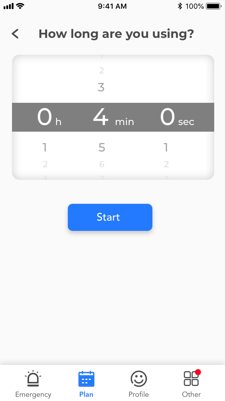
- Someone or some sort of technology supervising him while he’s using drugs.
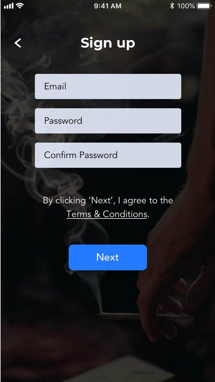
- To be anonymous when using any digital services regarding drug use.
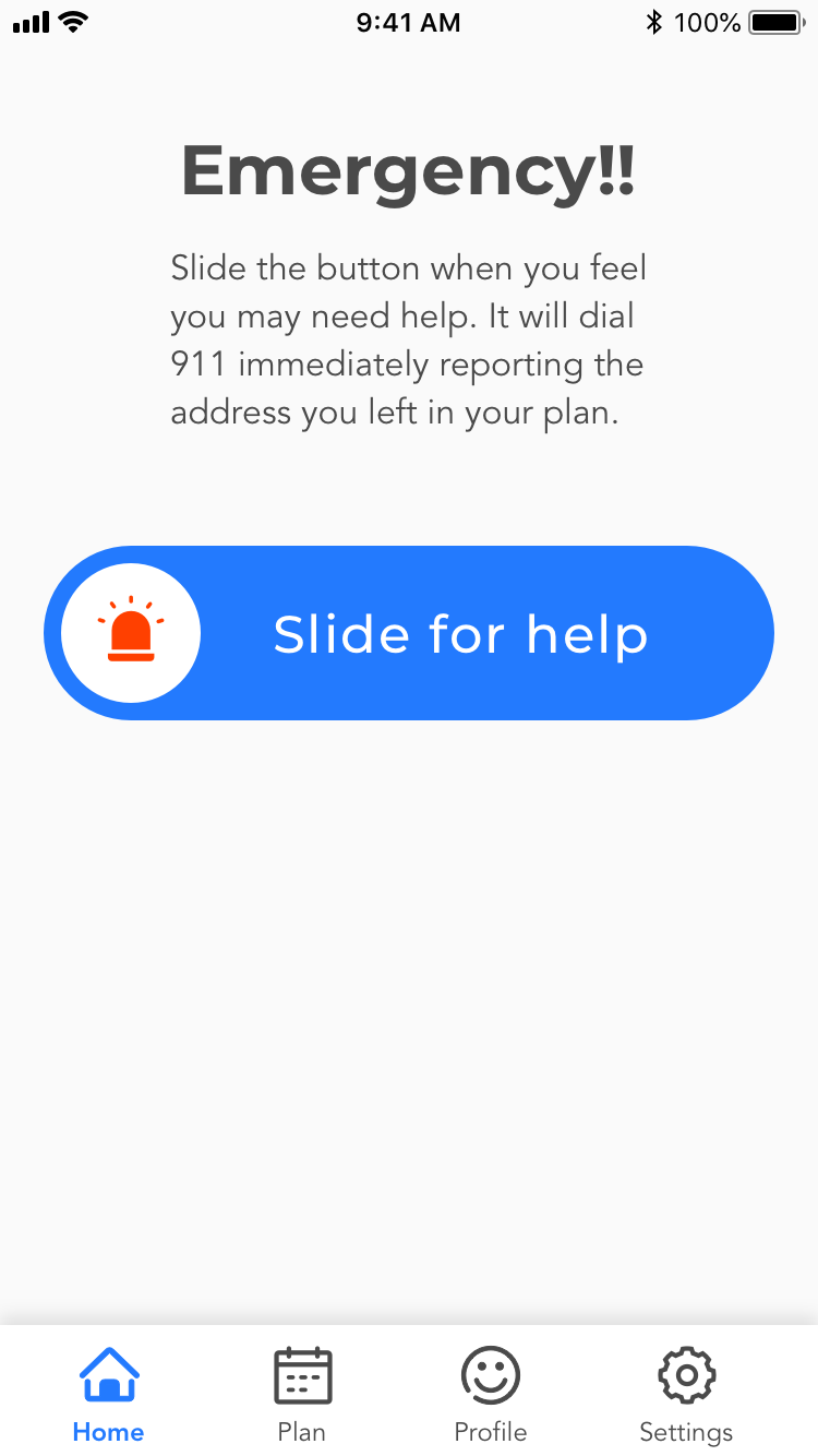
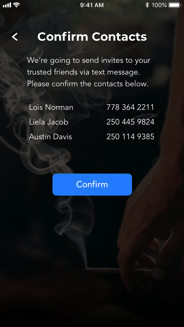
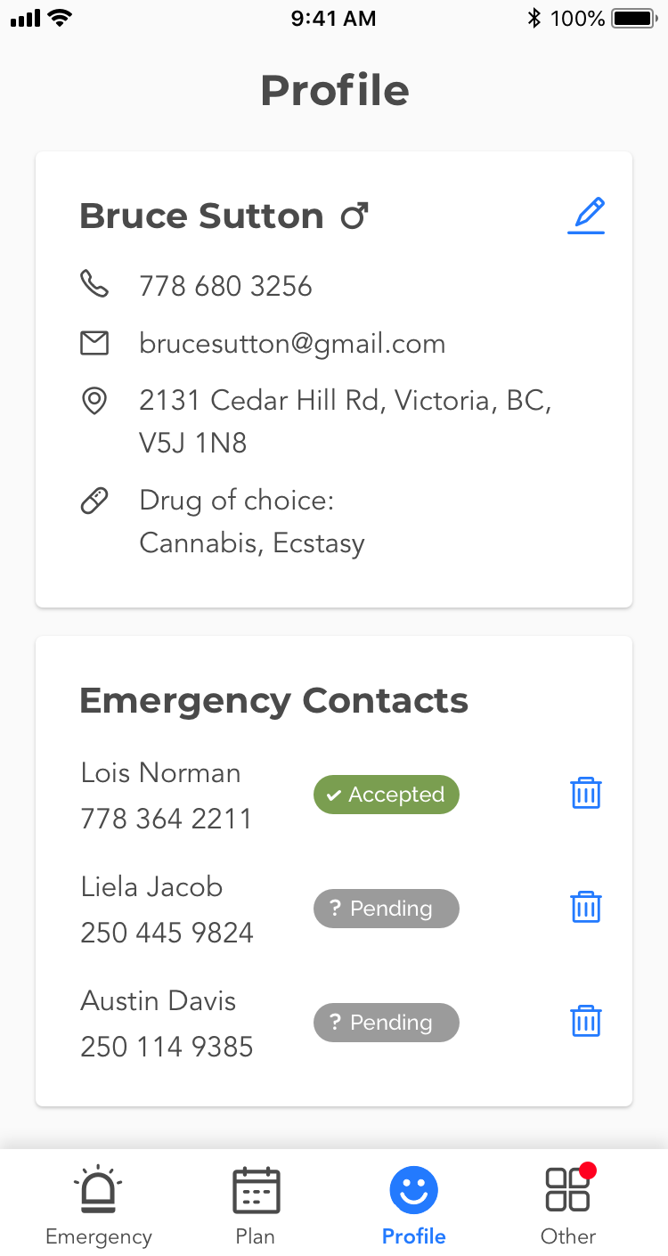
- Reach emergency service immediately when he or his friends are overdosed.
- The emergency service has his information so he doesn’t have to repeat it every time he calls for help.
Pains
- No trusted ones to supervise him while using drugs.
- Not comfortable going to a supervised safe inject / use site because of stigma.
- Too many steps to reach an emergency service when he’s overdosed, such as dialing, reporting address, etc.
- Worried about being reported if he uses any digital services or apps for drugging.