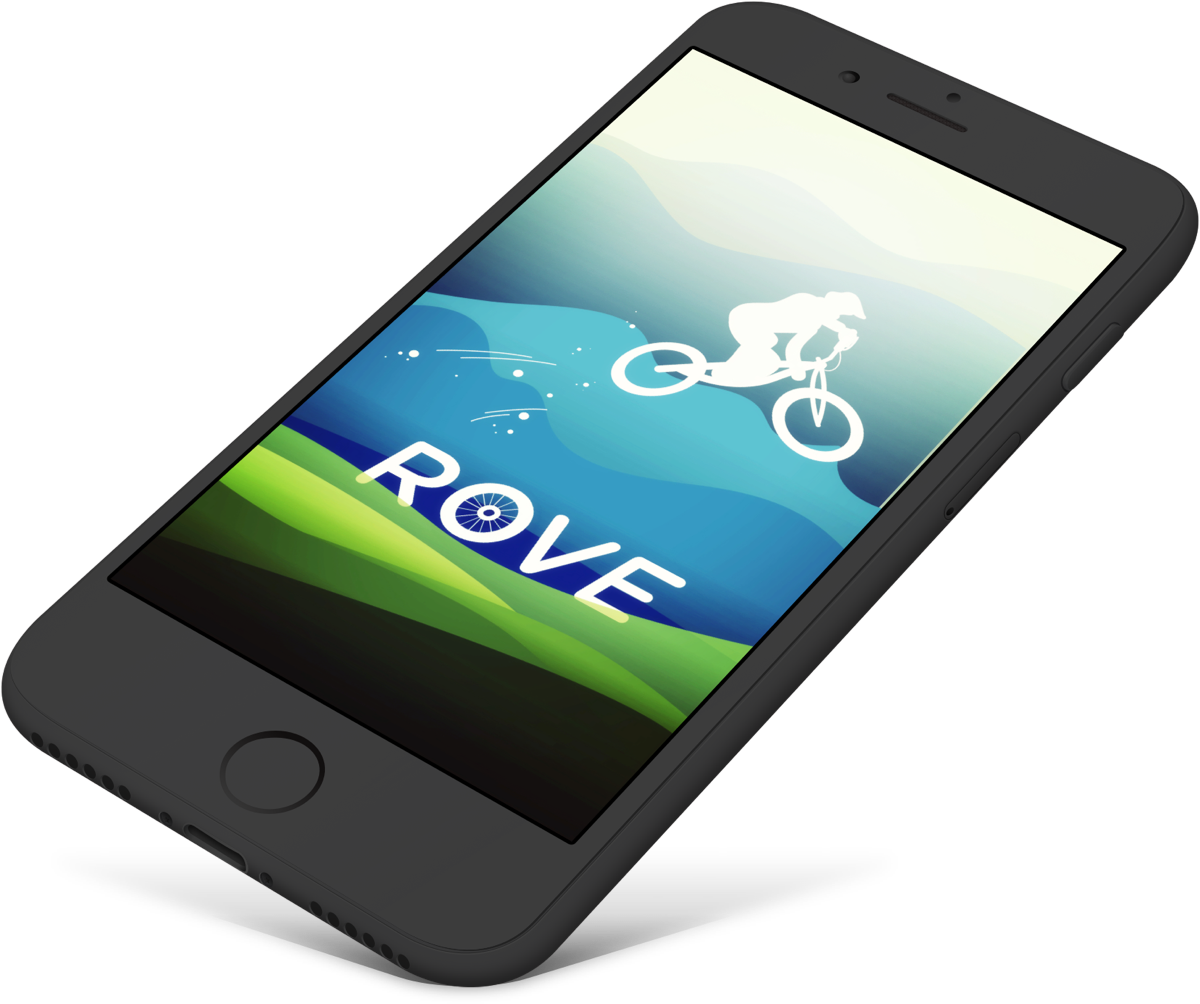
Rove is a mobile app providing extreme-sport tour experiences for adventurers. The first launch of this app will only focus on Mountain Biking, and later more sports options will be added under the the primary design. During the discovery phase, 100 hour was allocated for design including research, planning, wireframing, visual design, team communication, and client communication.
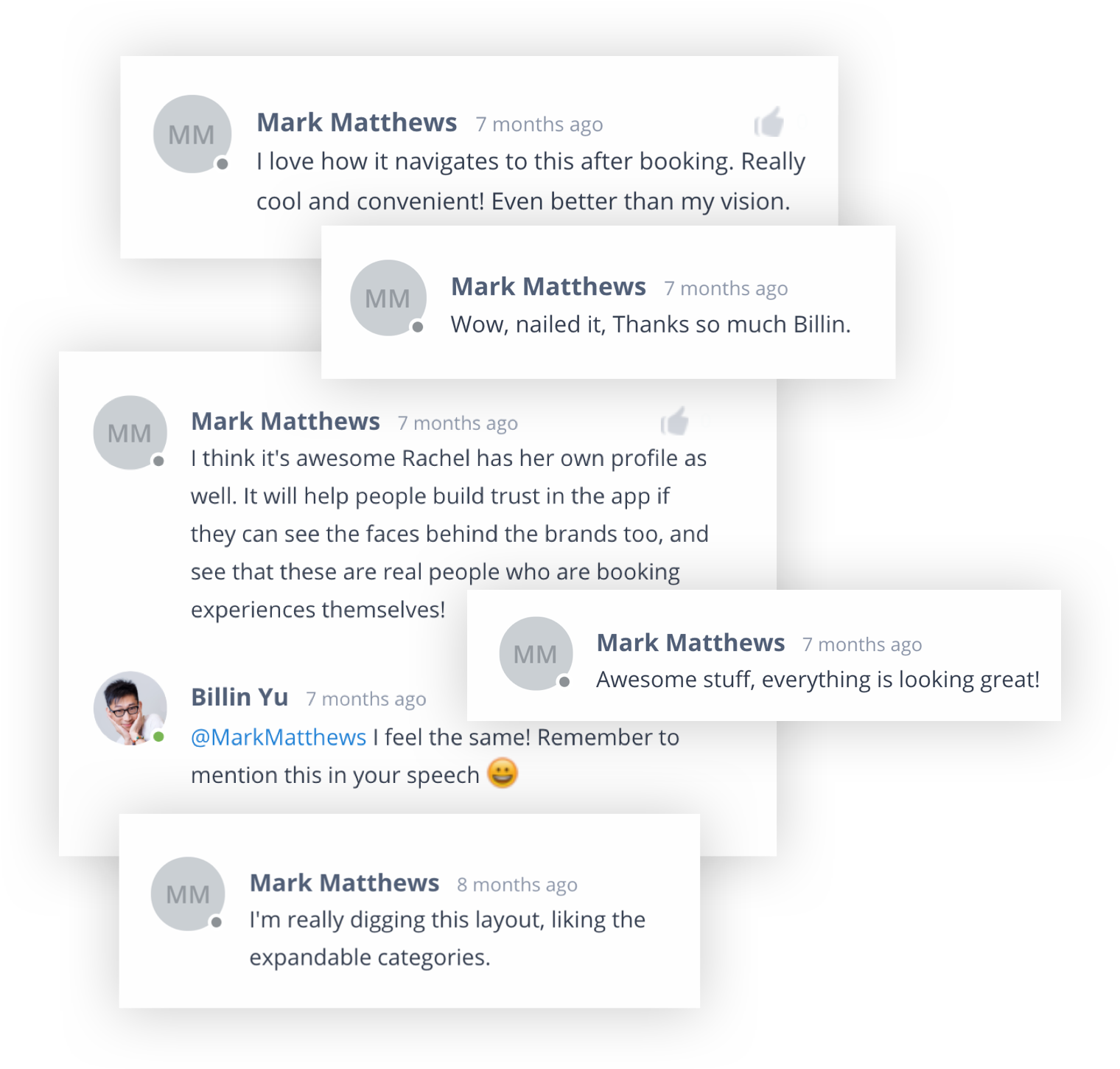
The client was collaborating with the team to provide domain expertise and functional guidance, along with regular & timely feedback on the deliverables. He highly approved our process and appreciated the outcomes. Most of his InVision comments are very cheerful and supportive.
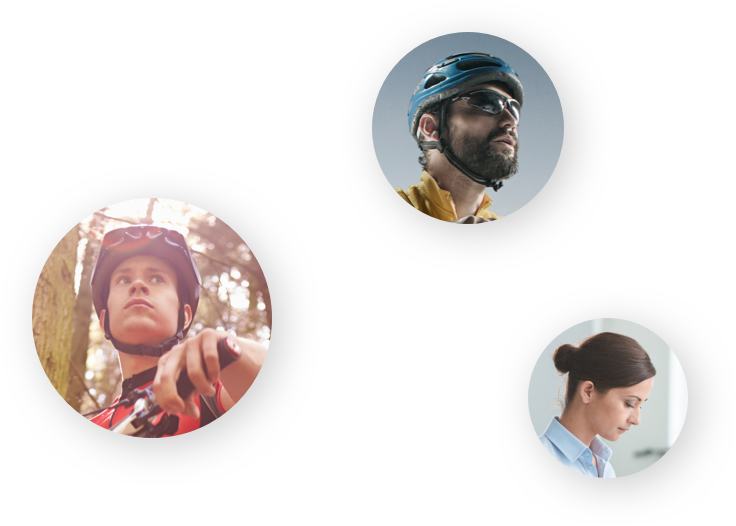
The primary target audience will be people who consider mountain biking as a hobby, having essential skills and doing it regularly. Jack is one of them and he is the main persona who helps the design.
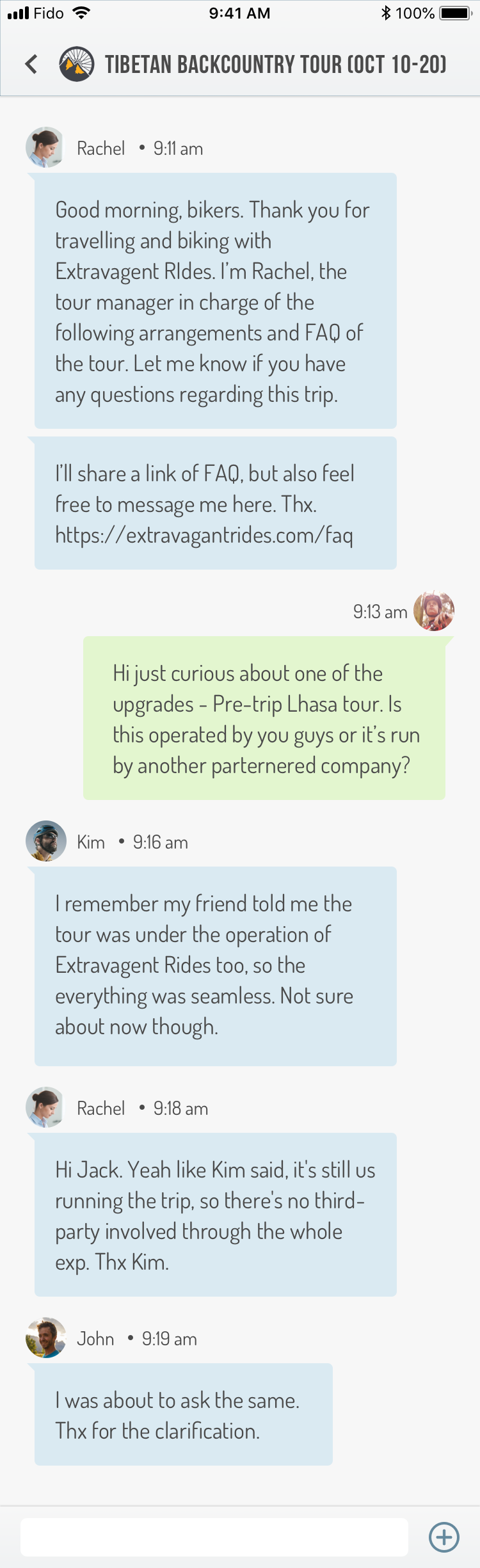
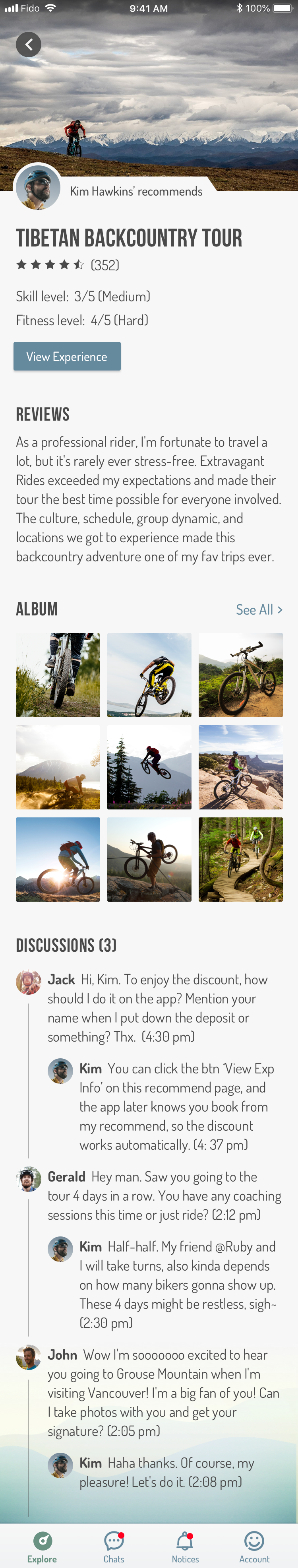
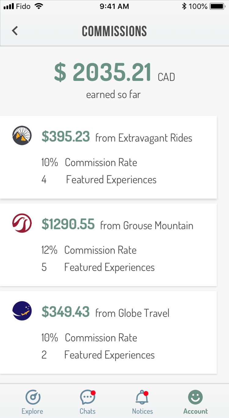
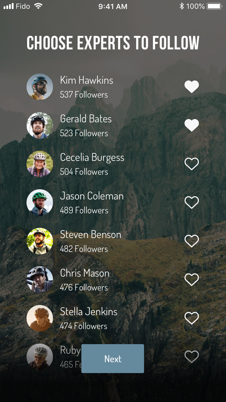
The secondary type of users will be professional riders or athletes who take mountain biking as career, try to lead the culture and influence the community. They attend the tours often and lead teams of tourists. They also gain the commission from the tour companies by helping attract more tourists. Kim is one of the ambassadors. He is verified by Rove and hired by multiple tour companies at present.
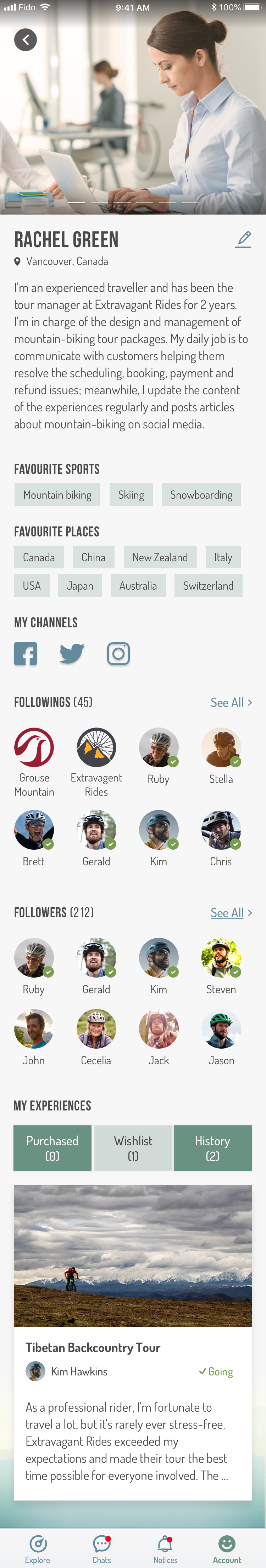
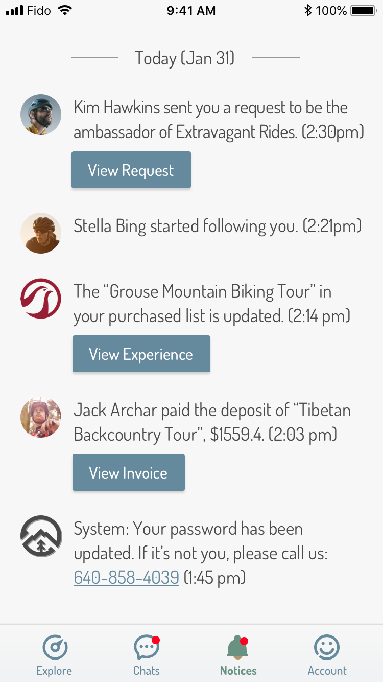
Another user type is the managers or coordinators of tour company. Since Rove will partner with many travel agencies to integrate their travelling packages in the app, the staff there should be able to interact with the customers and monitor their statuses in the app. Racheal is one of them.

"Travel is the only thing you buy that makes you richer."
25 years old • Freelancing Photographer
Jack likes cycling in the city and in nature. He is from Los Angeles and plans to visit Vancouver. He wants to have a nice three-day mountain-biking trip there. His biking skills are on an intermediate level so he’s able to join most of the biking experiences on mountain terrain. Biking is one of his essential activities when he travels to a new place. He prefers biking with friends, especially those more expertise than him, so he could learn from them. He enjoys taking photos all time on the way and biking gives him full flexibility in that regard. He is interested in sports news, follows major athletes on social media, and trusts their opinions on gear and locations.
Browse in the app just as easy as using social media.
Jack could explore experiences hand-picked by Rove, recommended by experts, and offered by companies they’ve followed. Meanwhile, he could browse in the community and see others’ followings, reviews or ratings.
The in-app booking and purchase makes everything easy, quick and safe.
Once Jack finds an interested tour experience, he could book it right away to pay for it without going out to the tour companie’s website and filling a load of payment info.
No need to call service and wait forever, just shoot a message and get the answer in a sec.
After the deposit is paid, Jack could join the group chat of the tour he’s going to and talk directly to the ambassador (leader of the trip), the tour company manager, and other companions in the same group.
Handy workflow for both ambassadors and tour companies to figure out commissions.
In the app, Kim could ask for commisions from the tour companies and track how much reward he’s earned. On the other side, Racheal who could view all applications of commissions and process them case by case.
One-stop platform for tour companies to manage trip information and help customers.
Racheal could create and manage content of all tour experiences, also monitor and manage the attendees. She has her public profile as well so she could interact with other tourists and athelets.
On top of the page flow, I translated the requirements to wireframes, and then apply visual elements to produce high-fi design.
The primary colors are green, blue and earthy, representing the nature. The general tone of the app is cool, fresh and modern. The choice of fonts are Bebas Nune and Dosis, which both look slim and sleek. Bebas is quite suitable for headers or titles as the text is all capitalized and angular - looking formal; whereas Dosis is a nice body text as it’s much smoother and lighter-weight which doesn’t look intensive even used in large paragraphs such as bios and descriptions. Photographs and icons are widely used thoughout the app to make it more visually-driven and also balance with the large volumn of text.


As the sole designer in the team, I was in charge of anything relevant to design. The chart on the right roughly presents what I’ve been working on throughout the project. In general, I touchbased on all areas a bit, but there were a few which took more efforts.
UX Leadership: I worked closely with project manager (PM), business analyst (BA), and sales/operations to ensure the deliverables impress the client and push forward the progress.
1. Decision-making: I talked with client face-to-face weekly to fully understand his visions, and then I sat aside with BA to digest and refine the user stories. Due to time constraint, I made decisions faster and moved on to the high-fidelity design without excessive wireframing, testing and iterating.
2. Win client trust: The client isn’t from the digital media industry, but he was tech-smart and acknowledged our process and methodologies. We didn’t have communication gap when aligning our visions or reconciling the styles. He was supportive and liked the design very much. All his comments on InVision was like ‘awesome!’, ‘Looks so great!’, ’This is so cool’, boosting the team’s morale and hence leading to better results.
UI/Visual Design: The general direction attempts to be more photo-driven and graphical, since large amount of text on certain pages (e.g. bio, description, itinerary) is inevitable. Meanwhile, the UI design pursues minimalist to reduce the noise amount. Specific to visual design efforts, the splash screen has been iterated many times, from illustration to realistic photo to somewhere in between and ended in illustration as it’s vivid, fluid and splashy - somehow consistent with the meaning of extreme sports.
Content Writing: Instead of lorem ipsum, I wrote all content revevant to the experience, so the client could foresee how the final product may look like. Inspired by this, the client spontaneously created the story of ‘Jack attending Tibetan Backcountry Tour’ and fleshed out the details with our guidance. The whole process was engaging to him and he felt involved in the design as well. Better still, the content in design will be consistent with the script of his product introduction, making his final demo-talk more narrative and cohesive.
Prototyping: The final product will be used by 3 types of users, so I created 3 clickable prototypes for each type of users and sent 3 separate links to the client for review. The client could examine the flows and logics by clicking through the screens.
Wireframe, UI design
Clickable Prototype,
Client Communication
Screen Recording
Animation
Video Editing
The client is quite happy about outputs and the process of working with us. He approved of the design every time and showed his appreciation of the design efforts. By the end of the project, he left a very positive review on Clutch. Recently, he used the design concepts to win some funding from Kickstarter which enables him to continue with the development phase. The team at FreshWorks is still negotiating with him about the budget and timeline to complete the full-fledge app.

