
Target Audience: The primary users will be people who are trying to kick the nicotine habit. This habit may be in the form of cigarettes, chewing tobacco and/or vaping. The secondary users will be non-smokers who are taking efforts to help their families or friends to quit smoking.
Design Directions: The client wants the app to be like either of the two themes below to match the concept of ‘Game Over’:
1) Cartoons, Fun, Marvel Comic Adventure
2) Futuristic computer, lazers, Beeping noises, Hologram
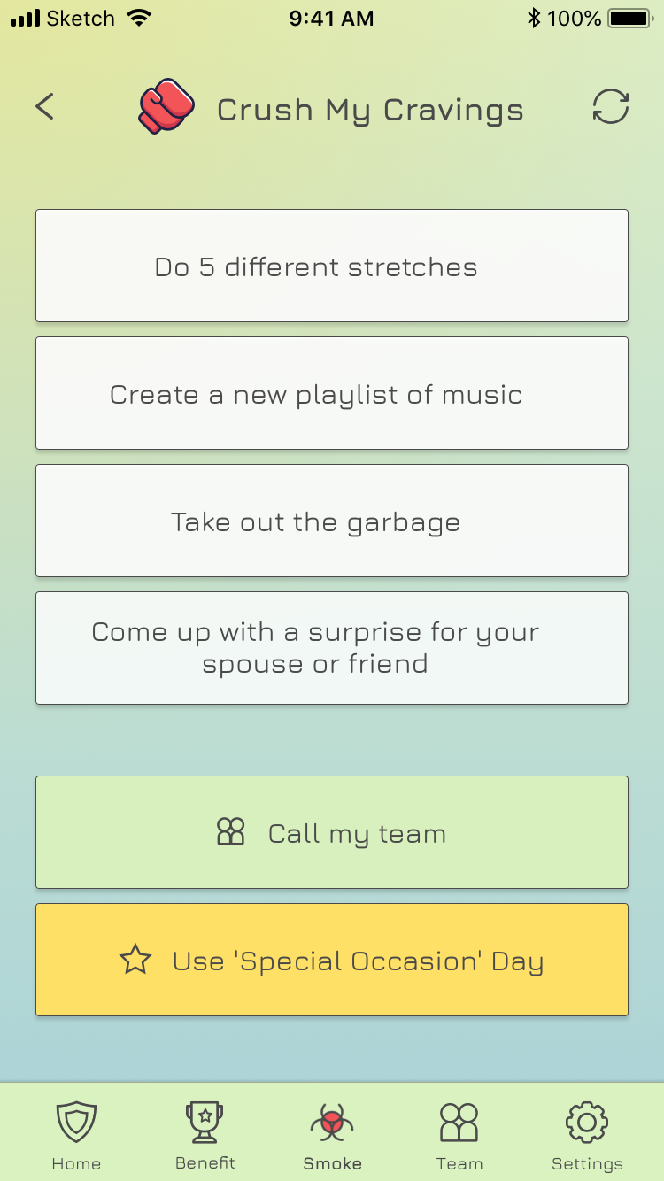
However, creating game arts following the above-mentioned styles under 40-hour budget is demanding. Alternatively, I tried leveraging different visual elements (typeface, icons, emojis) and the language tone to get the look-and-feel close to ‘cartoons’, ‘fun’, and ‘futuristic’.
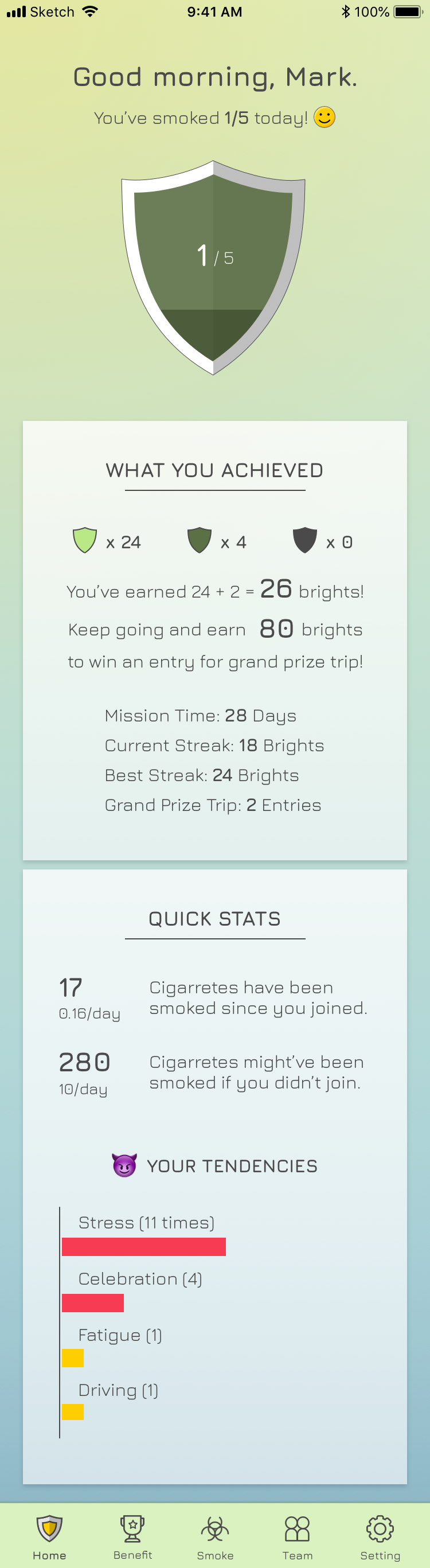
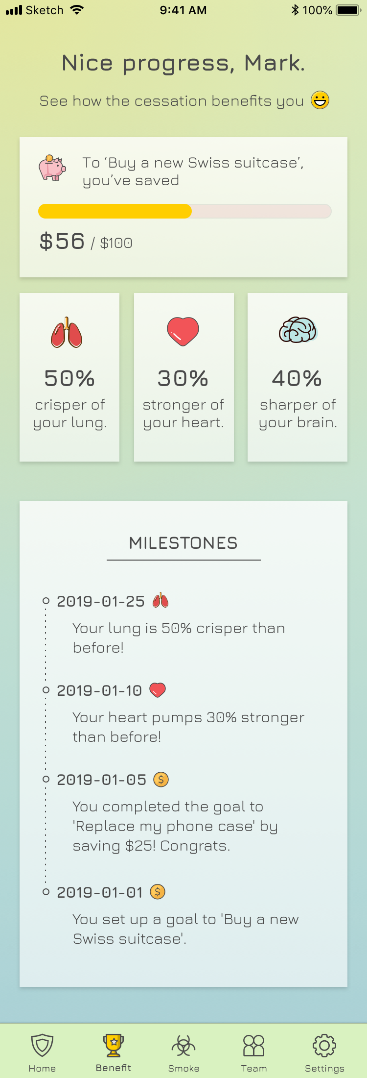
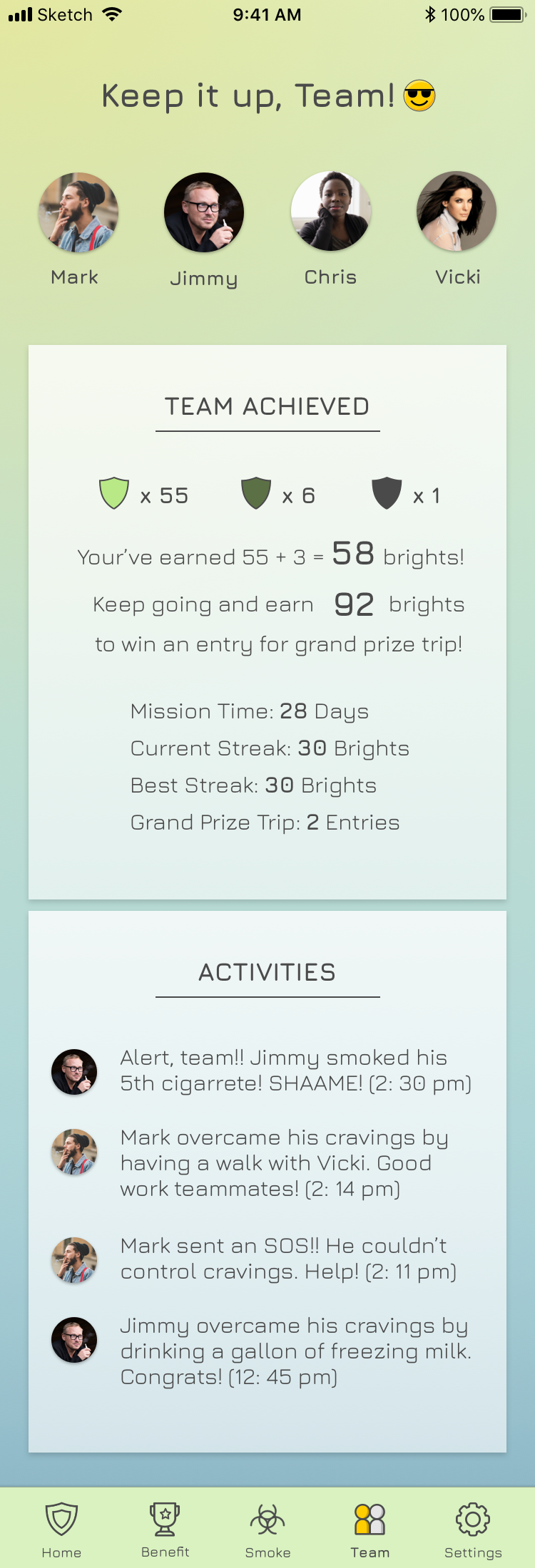
The primary colors are bright green and blue, representing a fresh, clean and healthy lifestyle.
Trying to quit and/or reducing nicotine consumption is a long battle since cigarette has been invented. In the project of Game Over Smoker (GOS), the client proposed a solution and hoped us to help realize it.
As discovery engagment, we produced User Stories and other relevant scoping documents with adherence to the requirements shared by the Client. Design was allocated for 40 hours to provide conceptual mockups for the app. Discovery resulted in a known scope for an MVP, and it produced an approximate timeline as well as an estimated price per features scoped.
The Client was collaborating with our team closely to provide domain expertise and functional guidance, along with regular & timely feedback on our deliverables.


I also came up with a dark mode, which was adored by the client, who thought the dark mode is close to ‘gamy’, ’sci-fi’, ‘futuristic’, and looks extremely ‘cool’.
As the sole designer in the team, I was in charge of anything relevant to design. The chart on the right roughly presents what I’ve been working on throughout the project. In general, I touchbased on all areas a bit, but there were a few which took more efforts.
UX Leadership: I worked closely with project manager (PM), business analyst (BA), and sales/operations to ensure the deliverables impress the client and push forward the progress.
1. Decision-making: During the 40-hour design time, I talked with client face-to-face weekly to fully understand their visions, and then I sat aside with BA to digest and refine the user stories. I made decisions faster and moved straight to the high-fidelity design without excessive wireframing, testing and iterating.
2. Win client trust: The client isn’t from the digital media industry, so they have little knowledge of product design/development. When we introduced our processes such as MVP, agile development, they were unaware of basically any of them. In this situation, they rely a lot on design - since it could bring the ideas to some tangible interface and they could confidently comment on something visible.
UI/Visual Design: The style of this app is fun, gamey, cartoonic. To keep the app design minimalist but still express the fun personality, I utilized the font, icons, emojis, and content writing. The font is ‘Jura’, which is sleek but a bit robotic. The icons and graphics are metapheric and gamey but still recognizable. The content writing is close to game language, cheerful and personal, treating users more like ‘fighters’ in game.
Content Writing: Specific to GOS, the tone of language affects the design a lot. Since the client wants it to be game-ish and fun, the wording should be closer to that scenario. Instead of showing plain labels or instructions, I spiced it up to make the language more stimulating.
Tools
Wireframe, UI design
Clickable Prototype