This is the capstone project during my study at BrainStation. It aims to improve the experience of tracking finances and make it more meaningful, engaging and approachable. The final product is expected to help young adults (20-40) note down every dollar they spend and mark the moments associated with it.
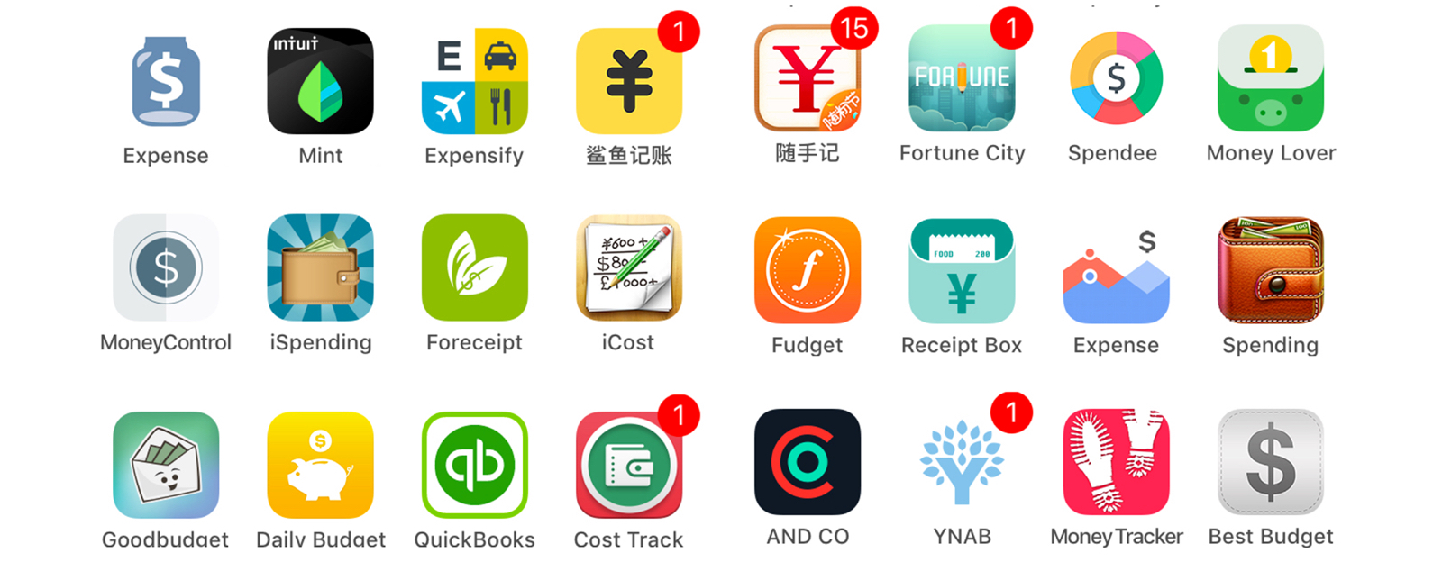
Due to the lack of an efficient and friendly money-tracking service, people gradually lose their interest in tracing their costs and earnings. Once they drop the basic financial management, they have trouble with further goals such as budgeting, saving, investing, etc. If a person stays ignorant about his/her financial status for long, it will loop as a vicious cycle – more aimless, losing more money, which detrimentally affects one’s life quality and hinders personal development.
People feel the process of tracking money every day is dry and demotivating, so HMW translate the process into a fun and engaging experience?
People find tracking money regularly is time-consuming and effort-taking, so HMW make the process more streamlined and effortless?
People feel the money-tracking tools are too complex and awkward to use, so HMW cut down the complexity and deliver a smoother and lighter-weight experience?
People may feel guilty after realizing how much money has spilled out this month, so HMW mitigate the negative feelings and lead them to a positive pattern?


Expense-tracking is not a fresh-new concept and is widely adopted as a daily routine for some people. In fact, there are an array of apps with fundamental or advanced money-tracking functions. In the analysis, 27 applications have been investigated. The results were divided into three categories, ranking from well-designed to hard-to-use.
After checking the temperature of the market, 4 of them stood out (Expense, Expensify, Mint, and Shark) due to smoother experience and stronger characteristics, which became the major references for my design.

The target audience is primarily young people, 20-40 years old, students or working professionals, who have a limited budget and want to know how their money is spent. They are active and care about the quality of life, hoping to keep a habit of tracking expenses but may end up finding it dreary and time-consuming. Technologically, they have an open attitude compared to the middle-aged group and thus have a higher chance to employ digital solutions to money-tracking experience.
I Interviewed 3 people by going through multiple questions. Then, I gave them a scenario and let them use two of the existing apps (Expense and Expensify) to track a specific expense.
The primary persona ‘Karen’ was created by analyzing the target group. The secondary persona ‘Jason’ was designed to cover more aspects of the audience.

26 • Graphic Designer • Single (dating) • Vancouver
Karen is a hardcore designer. She likes expressing ideas by illustration. She prefers well-crafted items embedded with thoughts. She has a habit of writing journals at times. She loves hanging out with friends, so dining out, shopping, hiking and traveling are essentials to her. Even barely saving money, she doesn't feel too bad because her life is joyful, but she does want to manage her finances a bit better. She tried tracking her finances intermittently but dropped it soon because she found herself not into dry statistics and analysis. She doesn't like to set up many budgets because she feels restricted, but she does need a limit to warn her curb the shopping cravings.
Track her expenses easily every day.
Be more aware of her financial status and save some money.
Note down some moments in a day, ideally in an interesting way.
Nice-looking notes are paramount to her.
Forget the expenses in a day and feels tired of keeping all the receipts.
The expense-tracking apps are too numerical and analytical. It’s hard to use them in a long term.
Too much efforts to input the expenses on the phone.
Too much efforts to write lots of text on the phone.
Feels confused that how did she spend so much money every month.
Feels overwhelmed to read the transactions on the credit card report.
‘Dollar Note’ introduces a storytelling concept to expense-tracking process, encouraging users to write down the costs in a narrative tone. Through it, users can have a clear vision of their expenditures and meanwhile enjoy the journaling experience, making the process more fun, personalized, and humanized. In other words, the expenses are the dots to connect the activities in a day and form the everyday story.
Make it fun and engaging - visual identity, animation
Make it simple and smooth - user flow, UI, interaction
Mitigate the negative feelings of spending - meaningful storytelling
Among many ambitious features such as budgting, statistics, investing, one of the essentials, ‘adding expenses’, was selected as the MVP (minimum viable product). The task flow here describes the whole process of how a user adds an expense to the homepage (the expense sheet).

To begin with, pen and paper with iPhone template were used to sketch out the epic features and page flow. Then the low-fi wireframe (v1.0) was created by using the components of default IOS UI, which was mainly used for visualizing the task flow, testing its usability, and seeking for some inspiration from users.
After the first round of usability testing, the version was iterated to v2.0, which majorly fixed the navigation and updated the homepage style. The v2.0 was user tested and then iterated to the current version (v3.0).
As the sole designer in the team, I was in charge of anything relevant to design. The chart on the right roughly presents what I’ve been working on throughout the project. In general, I touchbased on all areas a bit, but there were a few which took more efforts.
Research: I’ve investigated both the market and users. I’ve done a thorough competitor analysis, and later interviewed people who regularly track their expenses to discover their needs and pains. The research validates many of my assumptions and leads to the unique solution to the problem space.
Information Architecture: Specific to this project, the IA helps me define the scope of the project. After knowing the various needs of the users, I’ve come up with multiple epic user stories. However, due to the time shortage, I decided to drill down to the primary task - adding expense, and devised a task flow for it to understand the app structure around this process.
UI/Visual Design: The branding colors are yellow and purple. The dominant color is yellow because it’s naturallyassociated with gold and wealth. Emotionally, yellow is bright, youthful, and light-hearted, which has a positive connotation and suits the app style and target audience.
Purple sits on the opposite side of the color wheel, which contrasts well with yellow. Besides, dark purple is outstanding among the vast amount of light colors such as white, grey and yellow, optimum for some buttons; light purple, on the other hand, is an excellent complementary color and can be used massively without causing visual fatigue due to its calm and bland nature.
SF pro is used throughout the app due to its clean, modern, and elegant characteristics. Nunito Sans is used for body text, which falls in the similar spectrum of SF.
Prototyping: The final prototype is presented on InVision with hotspots. Viewers could click through pages to practice logging in an expense.
Tools
Wireframe, UI design
Clickable Prototype