Discovery Engagement of
BC Federation of Students App
Project Summary
BC Federation of Students (BCFS) seeks a long-term partner to build and support their student discount program app (IOS, Android, Admin Backend) and has expressed an interest to hire FreshWorks Studio. To show our capabilities, spark a conversation and win the contract, designer was supporting the discovery engagement by competitor research and conceptual mockups.
20 hours was allocated for design support and the following epic user stories were chosen for design:
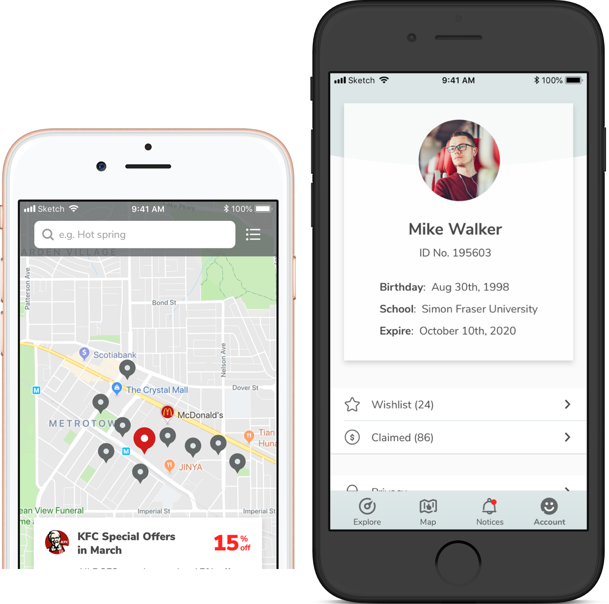
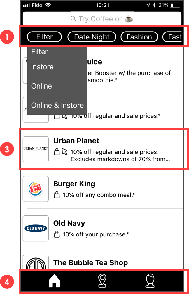
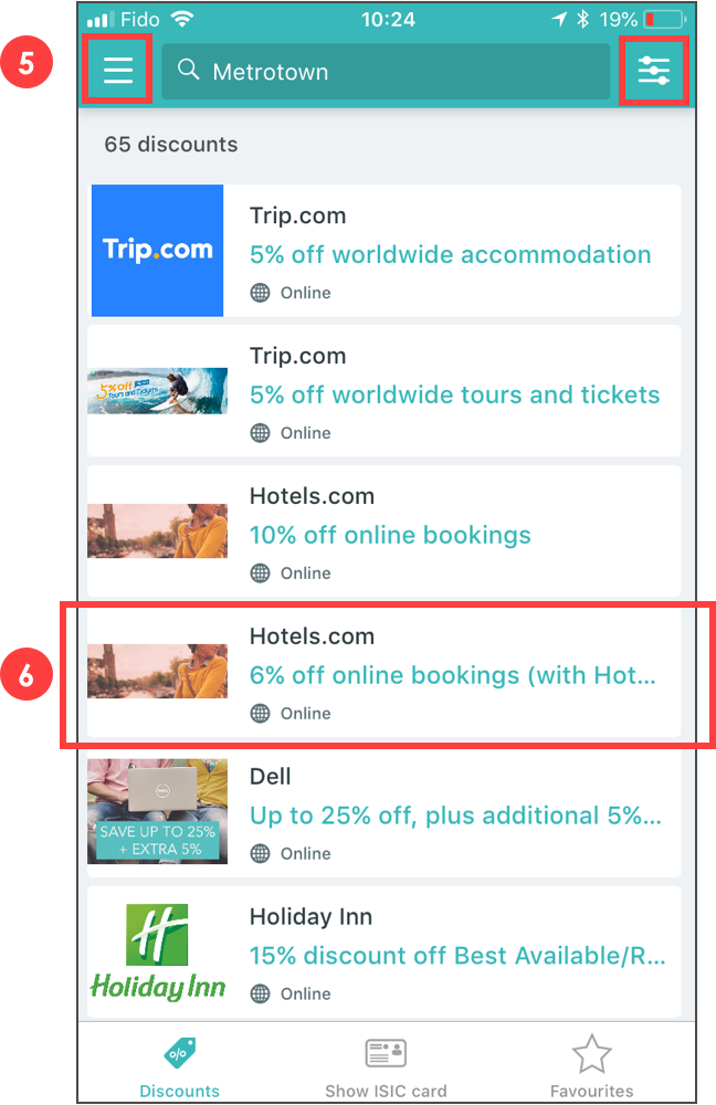
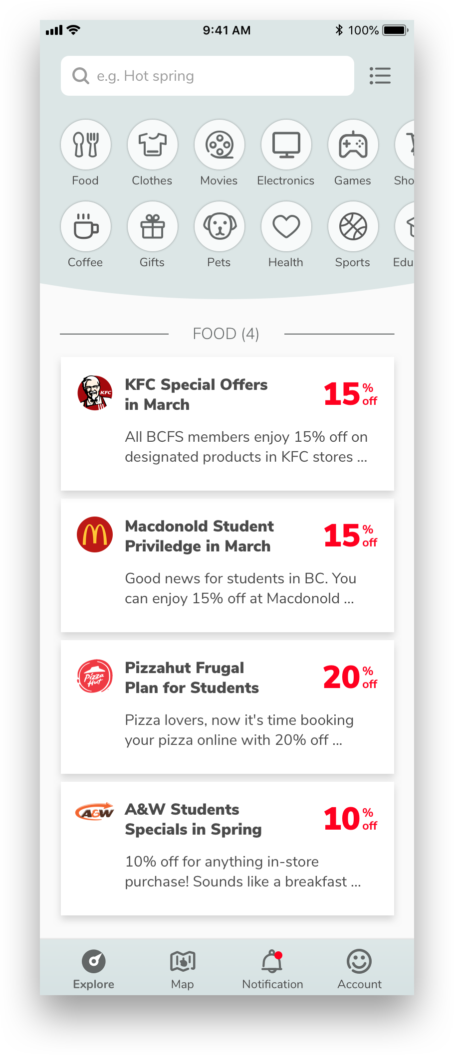
As a student I can view a list of partner businesses which offer discounts.
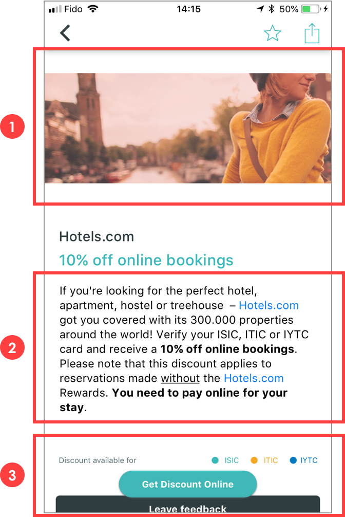
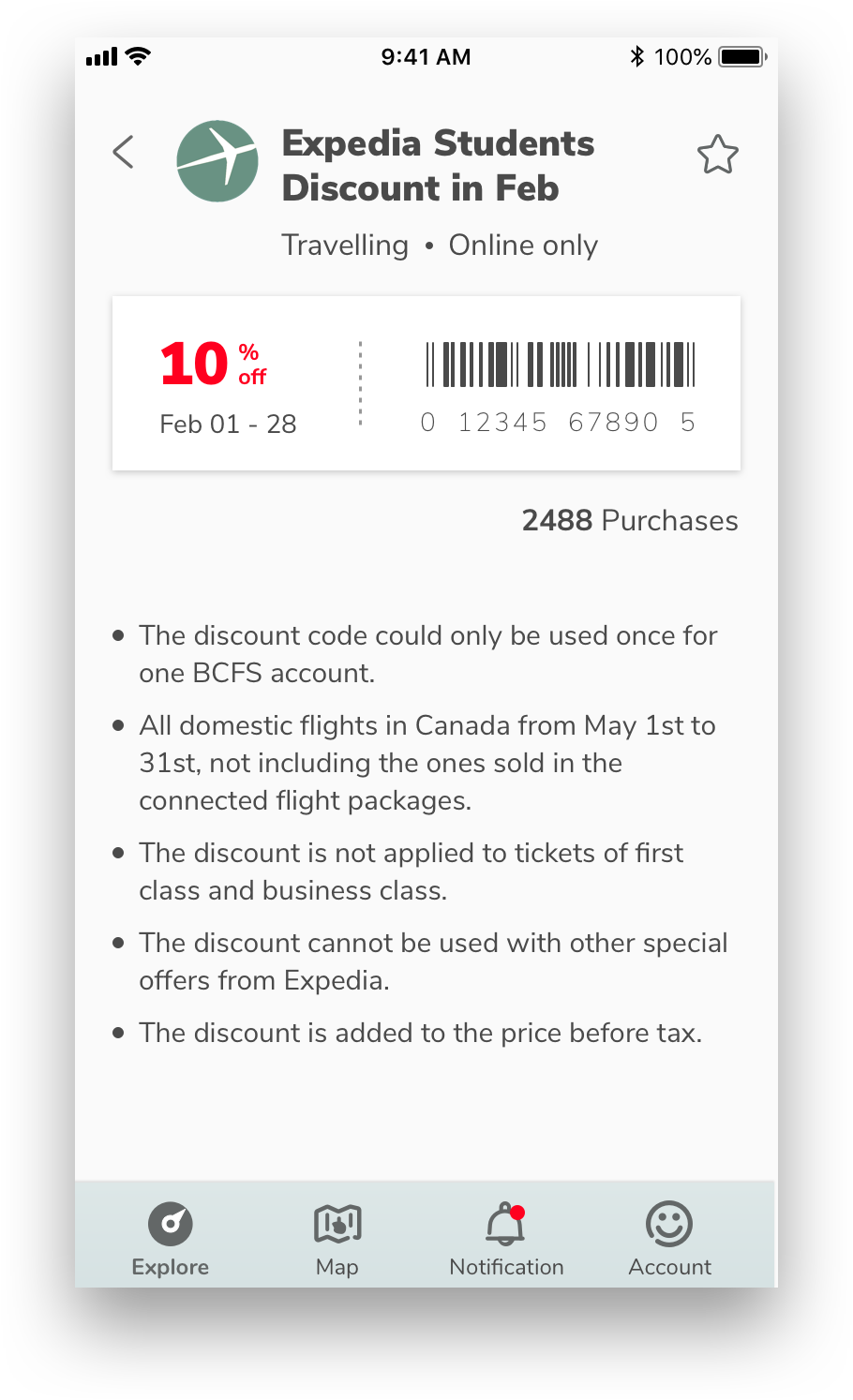
As a student I can select a business to view details on their discount(s).
As a student I can view the locations of partner businesses on a map.
As a member student I can view my virtual discount card.
Mobile Design
